1.2 What working with R looks like
We work with R in an interactive way. The R software itself is often associated with a console that has a blinking cursor used to enter commands and read results.
We wanted to reflect this work style in this book, which is why we present sample code alongside the output generated by the software. Both R instructions and their results are presented against a grey background so that you can find them quickly. Results are presented on lines that start with a double hash sign (##).
For example, the substr() function cuts out a substring with the coordinates provided in the parentheses. When you run the R software, you only need to type the instruction below to see the result in the same console window. Here, the result will be a string containing a single R letter.
substr("What is supeR?", start = 13, stop = 13)## [1] "R"When we write about functions, packages, and language elements, we use a fixed-width font. Some key English terms are written in italics. When we first mention a function name from an untypical package, we mention the package name.
The ggplot2::qplot() notation signifies function qplot() in the ggplot2 package. Sometimes, there are multiple functions in different packages that have the same name. In this case, we can precisely specify the function by providing the name of the package in front of it. When we need to install or turn on an uncommon package to use a given function, it is better to know which package offers the given function. At the end of this book, there is an index of functions – they are presented both alphabetically and by packages.
1.2.1 Example: Poland in the FIFA ranking
Let us find out what “serious” work with R looks like based on the example below.
We will use some functions from the
rvestpackage to directly read Poland’s FIFA rank from Wikipedia.We will use some functions from the
tidyranddplyrpackages to transform the data into the appropriate form.We will use some functions from the
ggplot2package to graphically present the data.
The entire R code which deals with those 3 stages is quite short and easy to analyse in a step-by-step manner. Some elements may seem familiar while others will appear surprising. We will explain the meaning of each element in subsequent sections.
All R instructions contained in this book can be downloaded from http://biecek.pl/R. The R instructions provided will always yield the same results. The only exception from this rule are some plots that have been modified to increase their readability in print.
1.2.1.1 Loading data
The code snippet below loads a data table from the Polish version of Poland national football team available on Wikipedia. We used rvest, a package which is very useful for downloading data from websites.
There are multiple tables on the site we are interested in. We get them all, and then choose the one with 14 columns. Having loaded the data, we show the first 6 rows.
library("rvest")
wikiPL <- "https://pl.wikipedia.org/wiki/Reprezentacja_Polski_w_pi%C5%82ce_no%C5%BCnej_m%C4%99%C5%BCczyzn"
webpage <- read_html(wikiPL)
table_links <- html_nodes(webpage,xpath='//*[@id="mw-content-text"]/div[1]/table[31]')
tables <- html_table(table_links)
tab <- as.data.frame(tables)
tab <- tab[-c(1:3,30),]
head(tab)
## Miesiąc.rok I II III IV V VI VII VIII IX X XI XII
## 4 1993 NA NA 20 22 23 26 28
## 5 1994 – 24 24 28 27 32 32 – 33 36 33 29
## 6 1995 – 32 – 34 36 29 32 28 28 27 33 33
## 7 1996 35 37 – 40 42 – 50 55 56 55 52 53
## 8 1997 – 56 – 52 57 57 51 53 50 45 47 48
## 9 1998 – 60 61 55 54 – 48 40 34 34 29 311.2.1.2 Data transformation
Another step after loading the data is cleaning and transforming it. To that end, we can use functions from the tidyr and dplyr packages. We will explain them in detail shortly. For the time being, we will provide an abbreviated explanation.
We change the data from the wide format, in which months are stored in different columns, into the narrow format, where all months are stored in a single column. Then, we change Roman numerals used for months into Arabic numerals. At this point, our data is ready to be presented graphically.
library("tidyr")
library("dplyr")
colnames(tab)[1] <- "Year"
colnames(tab)[2:13] <- 1:12
data_long <- gather(tab[,1:13], Month, Position, -Year)
data_long <- mutate(data_long,
                    Position = as.numeric(Position),
                    Month = as.numeric(Month))
head(data_long, 3)
## Year Month Position
## 1 1993 1 NA
## 2 1994 1 NA
## 3 1995 1 NA1.2.1.3 Graphical data presentation
Now that we have loaded the data, it is time we looked at it. We can use the ggplot2 package for graphical presentation purposes. Below, we present instructions that will generate the chart visible in Figure 1.3, which is called a box plot. It presents the minimal, maximal, mid-range and interquartile rank of Poland in each year of the ranking. We can see when the most prominent changes took place and when Poland reached its best ranks.
library("ggplot2")
ggplot(data_long, aes(factor(Year), Position)) +
  geom_boxplot() + ggtitle("Polish position in the FIFA ranking") +
                   xlab("Date of publication of the ranking") +
                   theme(axis.text.x = element_text(angle = 90, hjust = 1))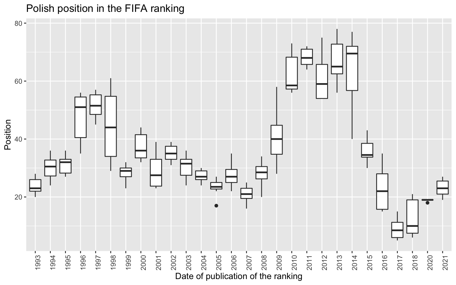
Figure 1.3: An example of a graph made using the ggplot2 package.The Polish position in the FIFA ranking is presented in various years.The last two years have seen a significant improvement.